1
0
Fork 0
Study in SVG animations. Visualizes GitHub contribution statistics with cool charts
Go to file
Gregory Eremin 4eb65ae957 Add readme 2015-04-08 15:59:47 +07:00
app Deployment 2015-04-07 18:07:41 +07:00
bin Sync script 2015-03-29 00:06:01 +07:00
build Update build script and nginx config 2015-03-28 23:52:16 +07:00
config Sync script 2015-03-29 00:06:01 +07:00
db Update schema 2015-04-06 22:29:24 +07:00
server Stat repo scoping 2015-03-22 20:25:18 +07:00
task Use two db queueing interfaces: Now and Later 2015-03-21 22:19:32 +07:00
.gitignore Phony data set 2015-04-06 22:31:25 +07:00
Makefile Deployment 2015-04-07 18:07:41 +07:00
README.md Add readme 2015-04-08 15:59:47 +07:00
config.example.json Configure app and server ports 2015-03-19 00:29:20 +07:00
nginx.conf Deployment 2015-04-07 18:07:41 +07:00
package.json Build script 2015-03-18 23:23:43 +07:00
schema.sql Update schema 2015-04-06 22:29:24 +07:00

README.md

Empact

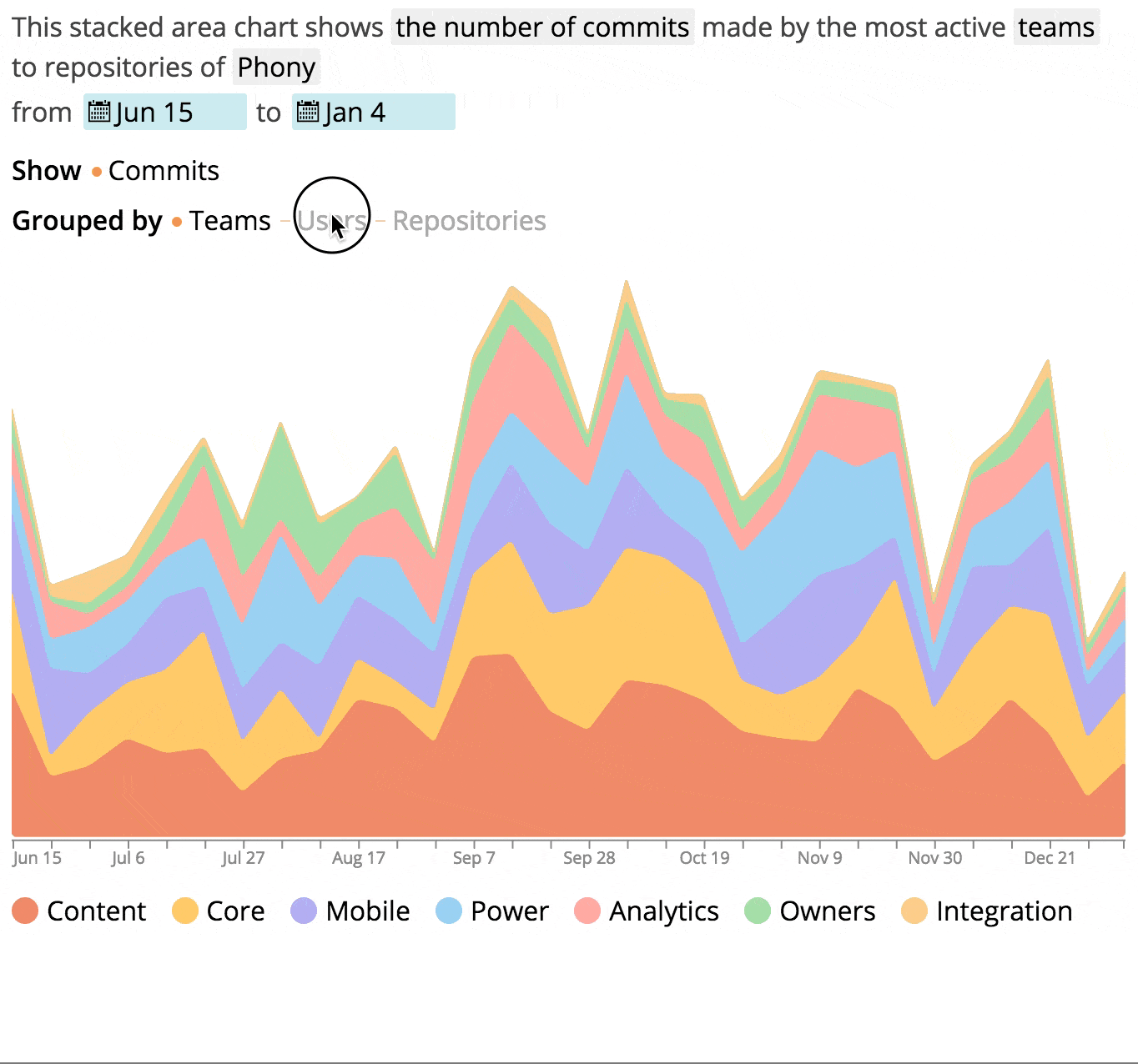
Empact allows you to take a look at developers' impact on the repositories of the company from all the different perspectives. It visualizes the contribution data gathered from the GitHub API and presents it in a couple of cool charts.

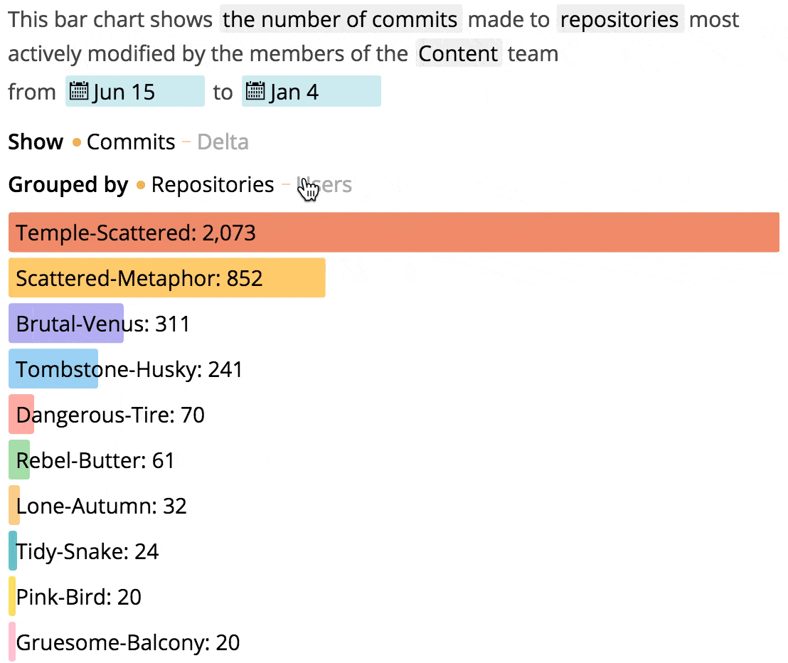
In order to visualize the data, two types of charts are used: the bar chart and the stacked area chart.

The back-end server is written in Go. The front-end application is built with React.js; charts are drawn in SVG.

At this point, the project is a working prototype, although most of its features are already complete. Data synchronization is mostly done, keeping data up-to-date is yet to be implemented.

Works best in Google Chrome, Safari has animation issues, Firefox and others have not been thoroughly tested yet.

Demo account of Phony organization is available here.